ESTsoft/프론트엔드 오르미 1기
[EST] 240619 CSS-06
효땡
2024. 6. 29. 12:20
flex
flex-shrink
- 아이템의 크기를 고정하거나 축소할 때 사용
- 값 = 0일 경우, 줄어들지 않음
align-self
- 부모의 align-items 속성을 덮어 flex-item에게 개별적인 align-items 속성을 부여
- 기본값 = stretch
align-self: stretch;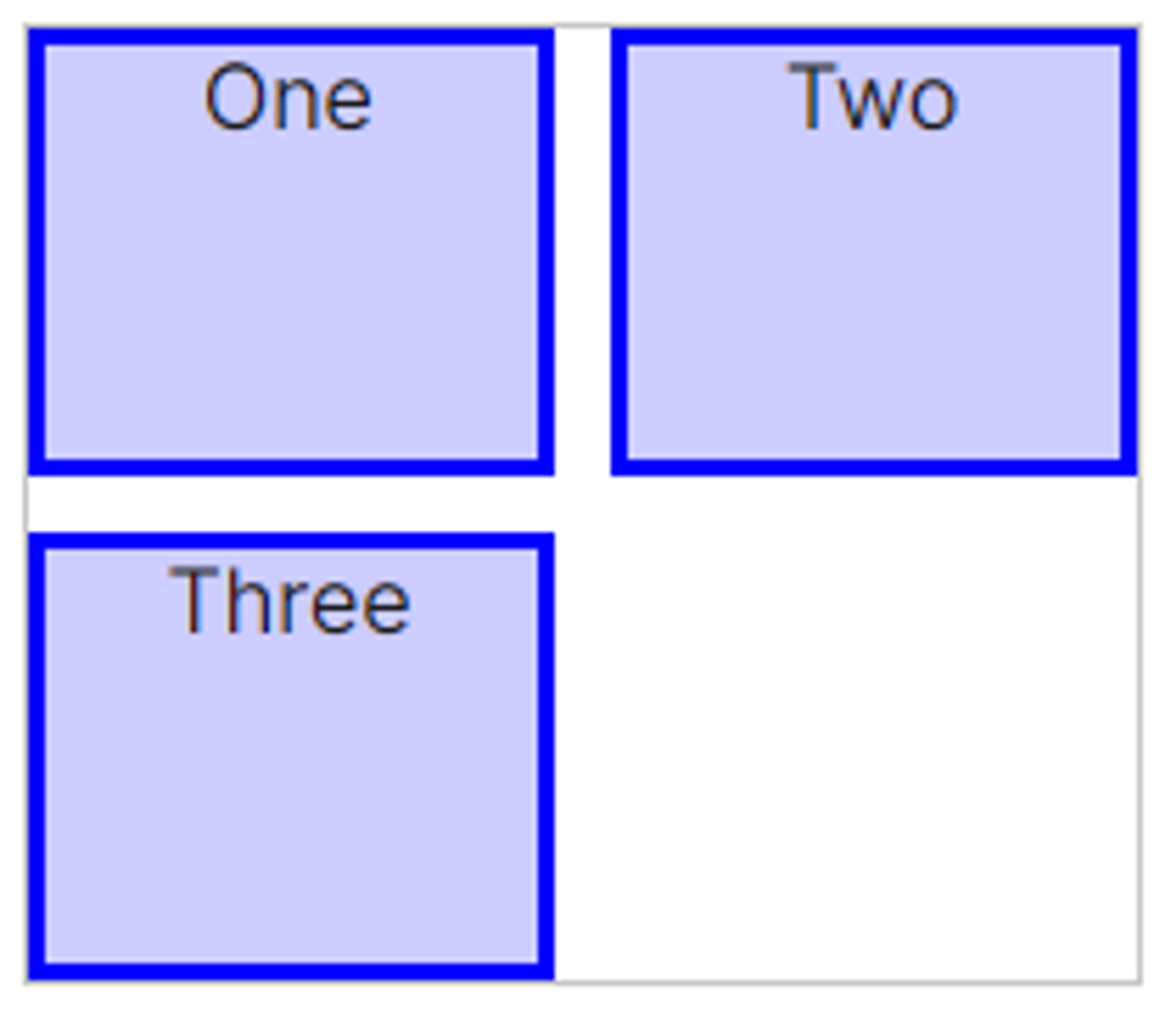
align-self: center;
align-self: start;
align-self: end;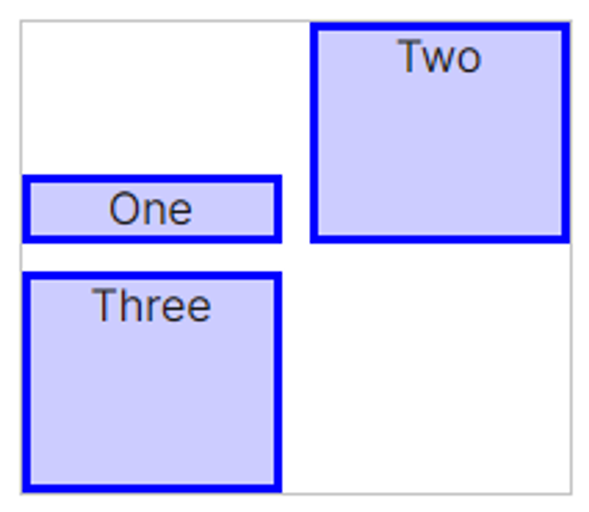
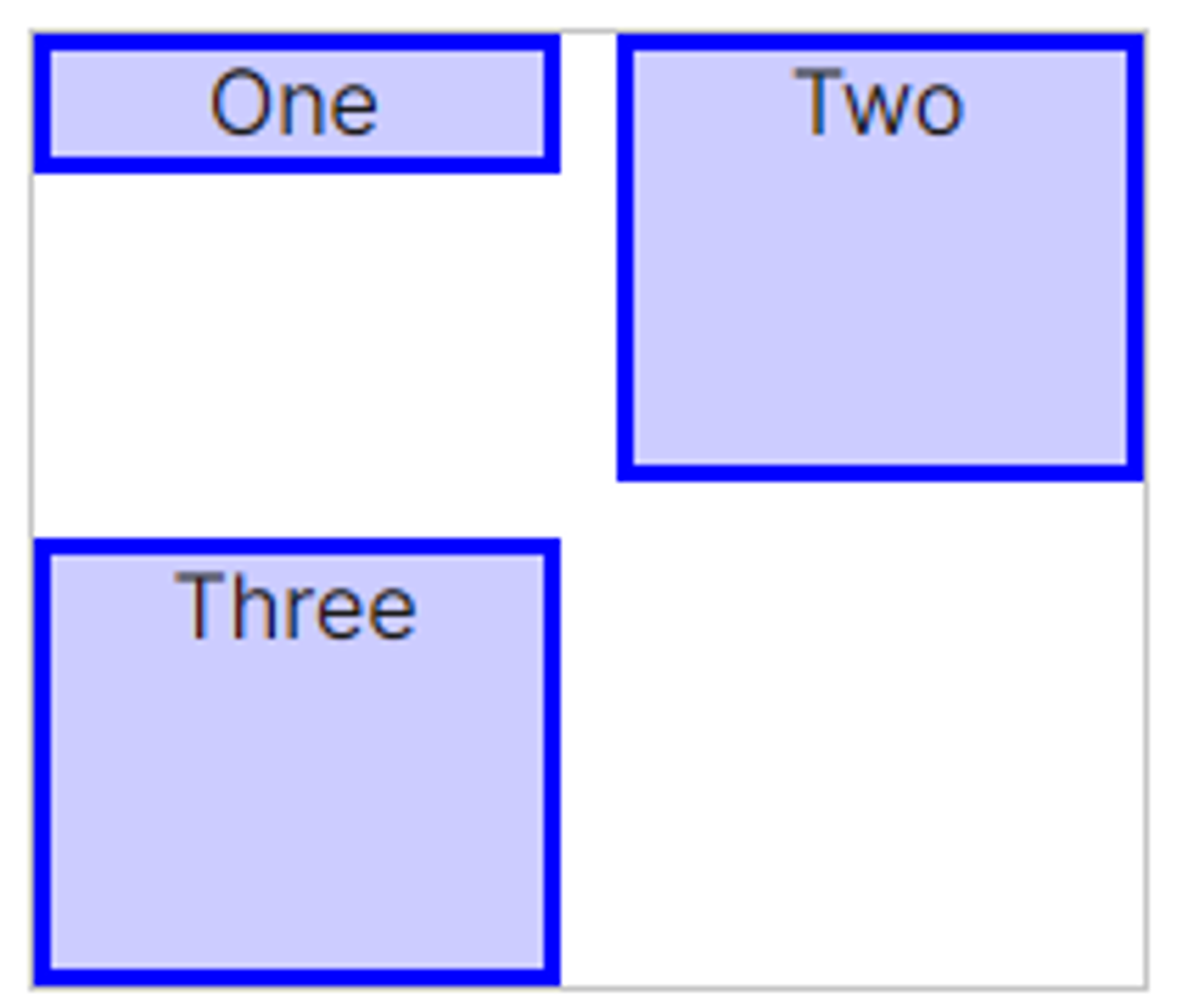
order
- flex-item들의 순서를 수의 크기로 결정
- 수가 작을수록 더 우선순위를 받음
- 음수도 가능
- 정렬이 될 때, order값이 없는 것이 먼저 정렬 후, order값이 있는 것이 그 후로 정렬됨
flex
- 단축속성
- flex-grow flex-shrink flex-basis
flex: 1 1 100px;[실습] 레이아웃 만들기
layout_float

 <style>
      header {
        background-color: skyblue;
        width: 100%;
        height: 100px;
      }
      section > article {
        background-color: royalblue;
        width: 70%;
        height: 400px;
        float: left;
      }
      aside {
        background-color: greenyellow;
        width: 30%;
        height: 400px;
        float: left;
      }
      footer {
        background-color: salmon;
        width: 100%;
        height: 100px;
        clear: both;
      }
    </style>
<header>header</header>
<section><article>section > article</article></section>
<aside>aside</aside>
<footer>footer</footer>
layout-flex

<style>
      header {
        height: 100px;
        background-color: skyblue;
      }

      .wrapper {
        display: flex;
      }

      section {
        flex-grow: 1;
        height: 400px;
        background-color: royalblue;
      }

      aside {
        flex-basis: 200px;
        flex-shrink: 0;
        height: 400px;
        background-color: yellowgreen;
      }

      footer {
        height: 100px;
        background-color: salmon;
      }
    </style>
<header>header</header>
<div class="wrapper">
<section>
<article>article</article>
</section>
<aside>aside</aside>
</div>
<footer>footer</footer>